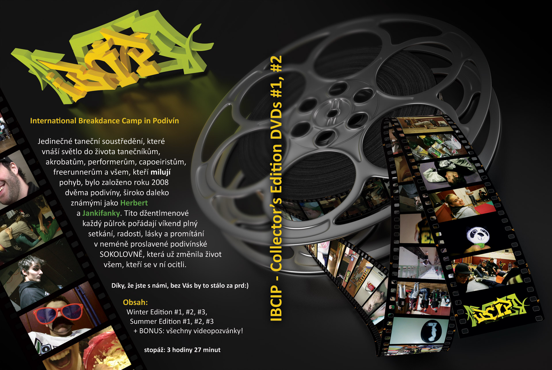
IBCIP stands for International Breakdance Camp in Podivín and it is name of dance weekend camp that takes places twice a year in Podivín. Its main goal is to unite streetdancers, b-boy, b-girls, parkourists and gymnasts among others while generating interesting experience, ahem.
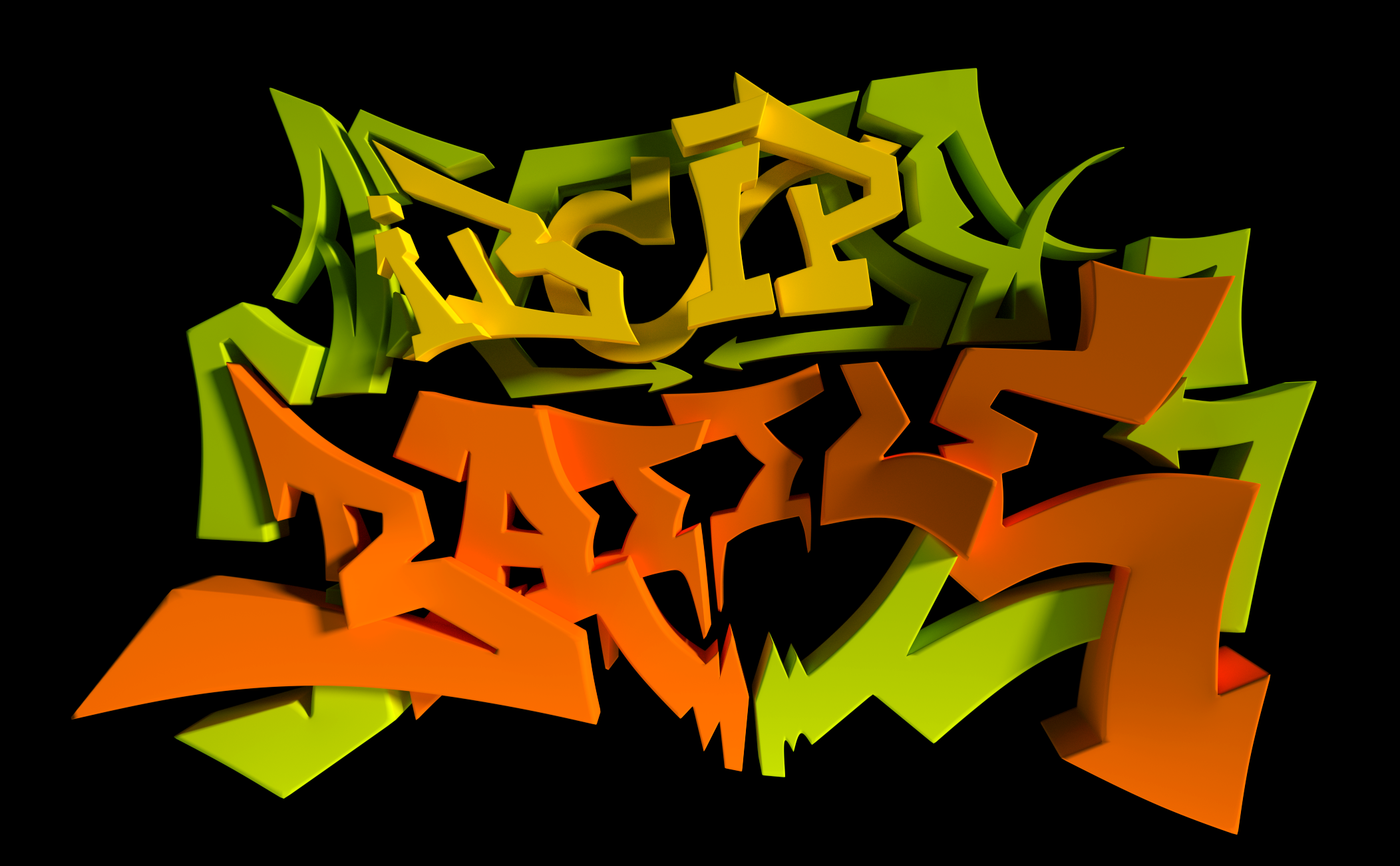
So far, last addition to original logo is the word Battle. I did that because of first officially publicly accessible battle. This logo is base for whole visual style of everything that surrounds this event – promotional graphics, video invitations and animations used in IBCIP videos.
First IBCIP took place in January 2009 and since then we make documentaries from each one. Then, when next comes up, we have a movie projection and remind ourselves about what was happening last time. We also create a variety of video-invitations each time. After five years we have quite a lot of material so we’ve made a DVD from it:
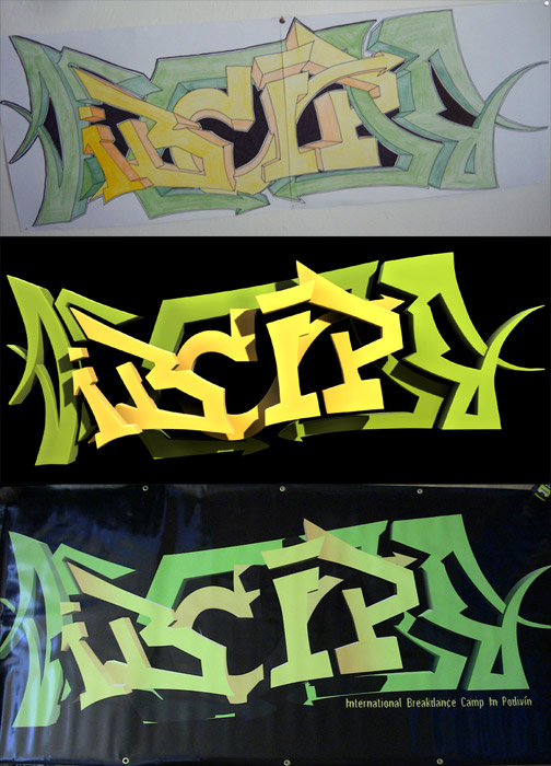
I created initial design in boring class at highschool in my paper notebook. Then I redrawed it on A1 format size (colored with pencils!). After that, I created a 3D version in Blender so that I can make intro animations and finally I vectorized it so that we can print it on tarpaulin.