There is a beautiful word play going on here. Translation of the word “jednoduchost” from Czech language is “simplicity”, but word-to-word translation would be something like “one-spiritness”. Creation of this sign was an interesting challenge. Main principle of this project is to spread both “materialistic” and spiritual information and to do it like from higher perspective (that we humans lack sometimes) and – most importantly – to put things SIMPLY. Also, there is an emphasis to remind every individual of his/her uniqueness, power and responsibility and what it means to be a human being on planet Earth. Part of designing this logo was exploration of sacred geometry and certain mathematical sequences and ratios, such as Fibonacci’s sequence or the golden ratio. However, after tens of hours of experimentation I found that some designs were way too esoteric and complicated. Even though I came across some interesting designs, I ended up with two simple forms – triangle and circle. These have various spiritual meanings on their own, but main intention was to depict Unity Consciousness that will be the basis of the age we are heading to, even though it may not seem like that at...
Since certain time, Magic/Mysticism does not mean for me only stage performance, but the highest science exploring the true nature of self and of Universe. While this may not be the main focus of pair of magicians from Náchod who used to call themselves Duo Carlos, work on this logo charmed me, that‘s sure. By the way, if you’re looking for someone to do a great stage performance for you, be sure to check out their current website! Karel and Vera Kaspar not only wanted to change their pen name, but wanted me to conjure up the logo that would reflect their main branch. After looking for exotic/mystic word combinations/titles and also experimenting with new words we decided to use the name that will be clear on its own – Kaspar Magic. That laid basis for logo itself, so after many brainstormings, whirlwinds of ideas and lots of consultations we came to a final duel between the two favorites. After that we‘ve chosen the one that would right away give audience the idea that they are looking at magician‘s logo. Even though the result may look clean and simple, for sure it wasn‘t created by looking into a...
When it comes to putting trust into a web service, everything should look clear, synoptic and most importantly, trustworthy. Logo and visual style of FairList reflect clarity of credible service together with freshness that learning of foreign languages brings into play. FairList.cz is portal where you can find info about language schools and teachers and also their ratings created by real students so that you won‘t get burned when you choose the language teacher next time. Besides the logo I also create webdesign, majority of HTML and CSS and various graphics for printing and for our Facebook page. ...
IBCIP stands for International Breakdance Camp in Podivín and it is name of dance weekend camp that takes places twice a year in Podivín. Its main goal is to unite streetdancers, b-boy, b-girls, parkourists and gymnasts among others while generating interesting experience, ahem. So far, last addition to original logo is the word Battle. I did that because of first officially publicly accessible battle. This logo is base for whole visual style of everything that surrounds this event – promotional graphics, video invitations and animations used in IBCIP videos. First IBCIP took place in January 2009 and since then we make documentaries from each one. Then, when next comes up, we have a movie projection and remind ourselves about what was happening last time. We also create a variety of video-invitations each time. After five years we have quite a lot of material so we’ve made a DVD from it: I created initial design in boring class at highschool in my paper notebook. Then I redrawed it on A1 format size (colored with pencils!). After that, I created a 3D version in Blender so that I can make intro animations and finally I vectorized it so that we can print it on...
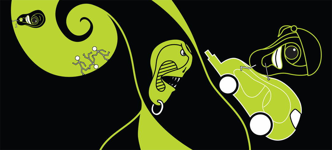
Another work from graphic design class at Multimedia College of Arts in Jihlava. This time it’s a story where all the words begin with the same letter. Final size: A1 silk-screen printing. I guess you’ll understand that exact translation from Czech language into English with the same letter on the beginning of each word is not quite possible. However, the story goes like this: Educated Ear escaped the usurper Finno-Ugrics. Ear escaped away from Wereear on the earcycle. Created little ears....