After 6 years I decided to recreate my personal logo so that it reflects more of who I am and what I am doing here. Logo that I used since 2008 felt a bit outdated. Currently I am not sure what I meant by it, but I guess it had to do with complexity of the human-mind labyrinth. Initially I wanted to use the so called sacred geometry principles but in the end I found it would be just a pose. I realize that this geometry deeply connects not only to my body, atomic structures or everything in existence, but I also learned not to insist on something just because I like it. I decided to create something that will more reflect the person who others call Tomáš Jankó or Jankosh – this body that I currently inhabit. This logo is a certain typographic play of letters that form my nickname and it depicts the wholeness of the male and the female principles we all have. Nobody is “pure male” or “pure female”. Integration of these principles assisted me a lot in understanding of what is going on inside of me and in further expanding my consciousness. Plus, supposedly, my new logo looks like a smiley...
Since certain time, Magic/Mysticism does not mean for me only stage performance, but the highest science exploring the true nature of self and of Universe. While this may not be the main focus of pair of magicians from Náchod who used to call themselves Duo Carlos, work on this logo charmed me, that‘s sure. By the way, if you’re looking for someone to do a great stage performance for you, be sure to check out their current website! Karel and Vera Kaspar not only wanted to change their pen name, but wanted me to conjure up the logo that would reflect their main branch. After looking for exotic/mystic word combinations/titles and also experimenting with new words we decided to use the name that will be clear on its own – Kaspar Magic. That laid basis for logo itself, so after many brainstormings, whirlwinds of ideas and lots of consultations we came to a final duel between the two favorites. After that we‘ve chosen the one that would right away give audience the idea that they are looking at magician‘s logo. Even though the result may look clean and simple, for sure it wasn‘t created by looking into a...
When it comes to putting trust into a web service, everything should look clear, synoptic and most importantly, trustworthy. Logo and visual style of FairList reflect clarity of credible service together with freshness that learning of foreign languages brings into play. FairList.cz is portal where you can find info about language schools and teachers and also their ratings created by real students so that you won‘t get burned when you choose the language teacher next time. Besides the logo I also create webdesign, majority of HTML and CSS and various graphics for printing and for our Facebook page. ...
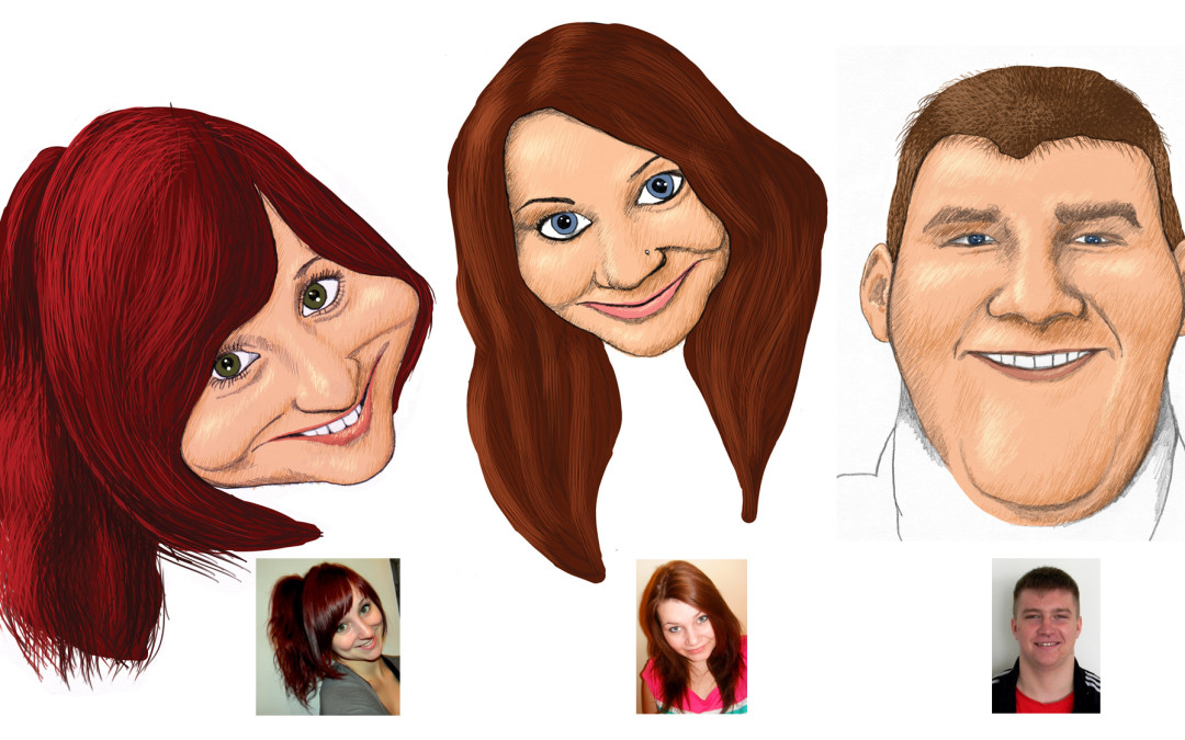
Believe it or not, high school graduates are very playful and creative people, ahem 🙂 My sister‘s class asked me to create tableau for them, where they would be depicted as carricatures. I did this together with my schoolmates Tomas Jajcik and Michal Vacek. Hand drawings are combined with digital...
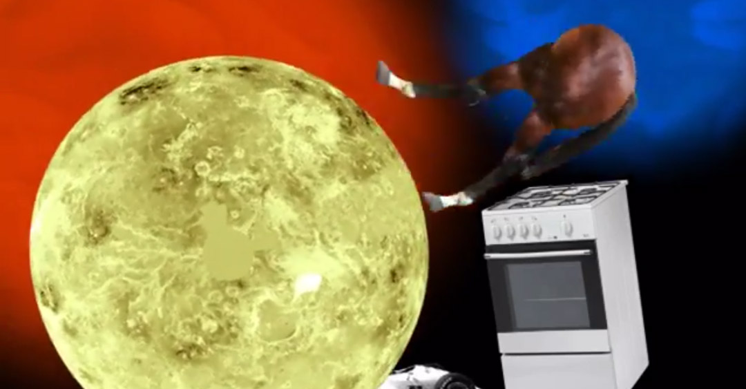
Intro animation for imaginary event I called Wildernes Festival. Semestral work for “Jingle” subject, After Effects animation. Once upon a time, I opened Google, closed my eyes, hit some keys on the keyboard and searched for pictures. The “mgn” letters found really lot of various images which I used to create this mockery....